

Introduction
We all know what is CSS Flexbox and CSS Grid, but often get confused between what to use and what not. I am here to help you out in this dilemma, we will do a positive comparison between both and at the end you will get to decide easily, which one you will prefer on your next project!
Points of Comparison-
- Dimensions
- Overlapping content
- Wrapping Content
Now let's discuss all of them in short.
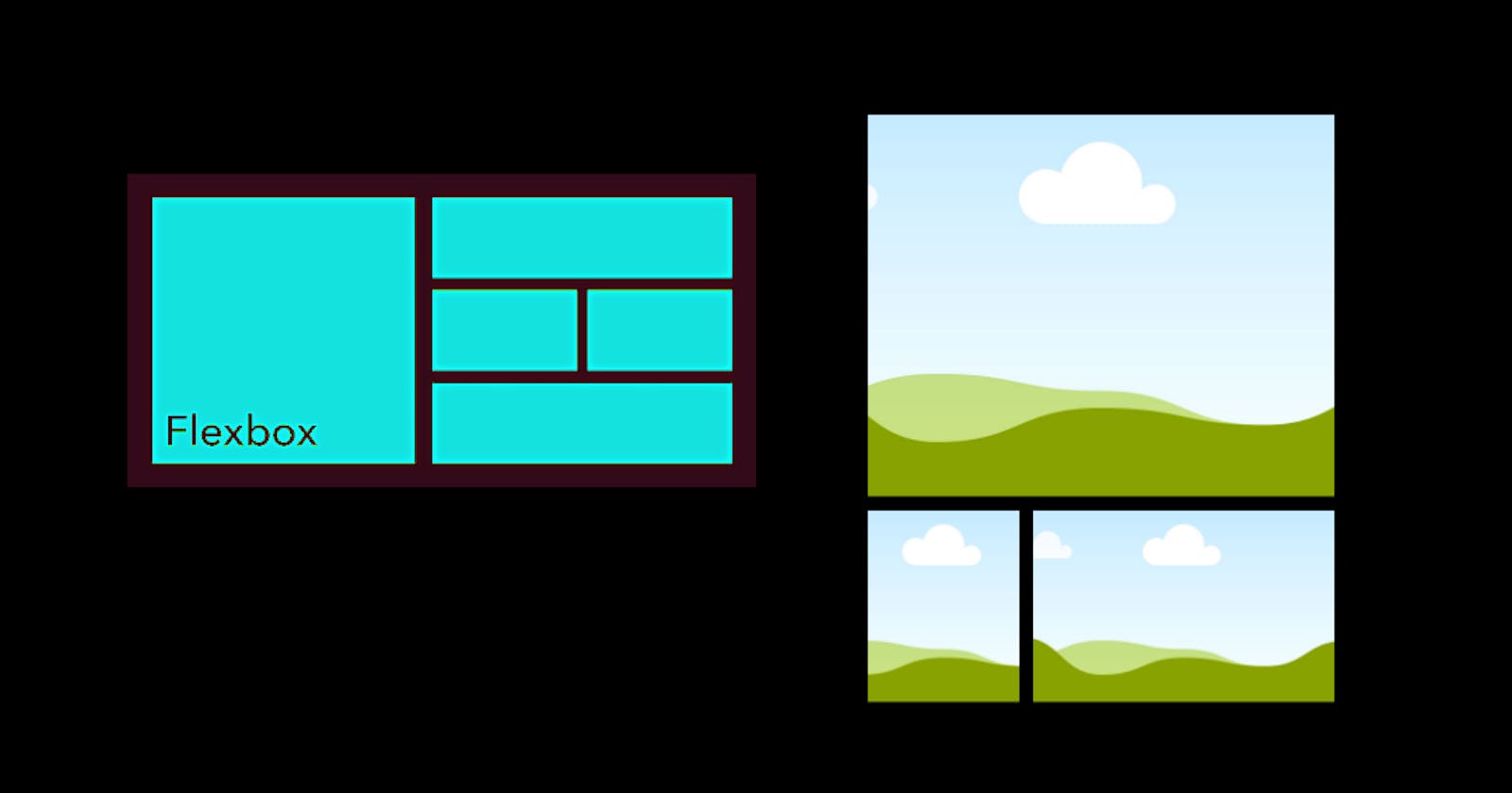
Dimensions
In flexbox, we use a 1-Dimensional model for positioning elements across the axis, either rows or columns. Whereas in Grid, we get to use a 2-Dimensional model (layout) for positioning elements.
Overlapping Content
In flexbox, you might have to use negative margins and absolute positioning to overlap items, because of which, the code gets messy! On the other hand, grid can place items overlapping each other in the same cells!
Wrapping Content
Flexbox switches to another row for wrapping content around and takes a little more space. Grid can wrap content around the same grid lines in the respective row or position as well!
Conclusion:
In the end, what to choose depends on your project specifically. Use a grid for multi-dimensional layouts and flexbox for better alignment respectively. If the work is in multi-dimensional layouts, use grid! and if it can be done in either a row or a column, use flexbox!
Flexbox has its unique properties so does grid! but what matters is the use case! I am sorry If I confused you more instead of sorting the problem :P but this is the fun part of coding, you have to brainstorm and refine the particular properties in order to make it work!
Thankyou for reading it till here, have a great day ahead :)